Build a form that looks like your brand
Pick a preset or set every colour, font, corner and shadow yourself, with a live preview beside the controls. Light, dark or follow the visitor. Free on every plan.
A form is often the first page of yours a customer fills in. It should look like it belongs to you: your logo, your colours, your type, the same feel in light and dark. The Design tab does that in a minute for most forms and goes as deep as you want for the rest, with the live form beside the controls the whole time.
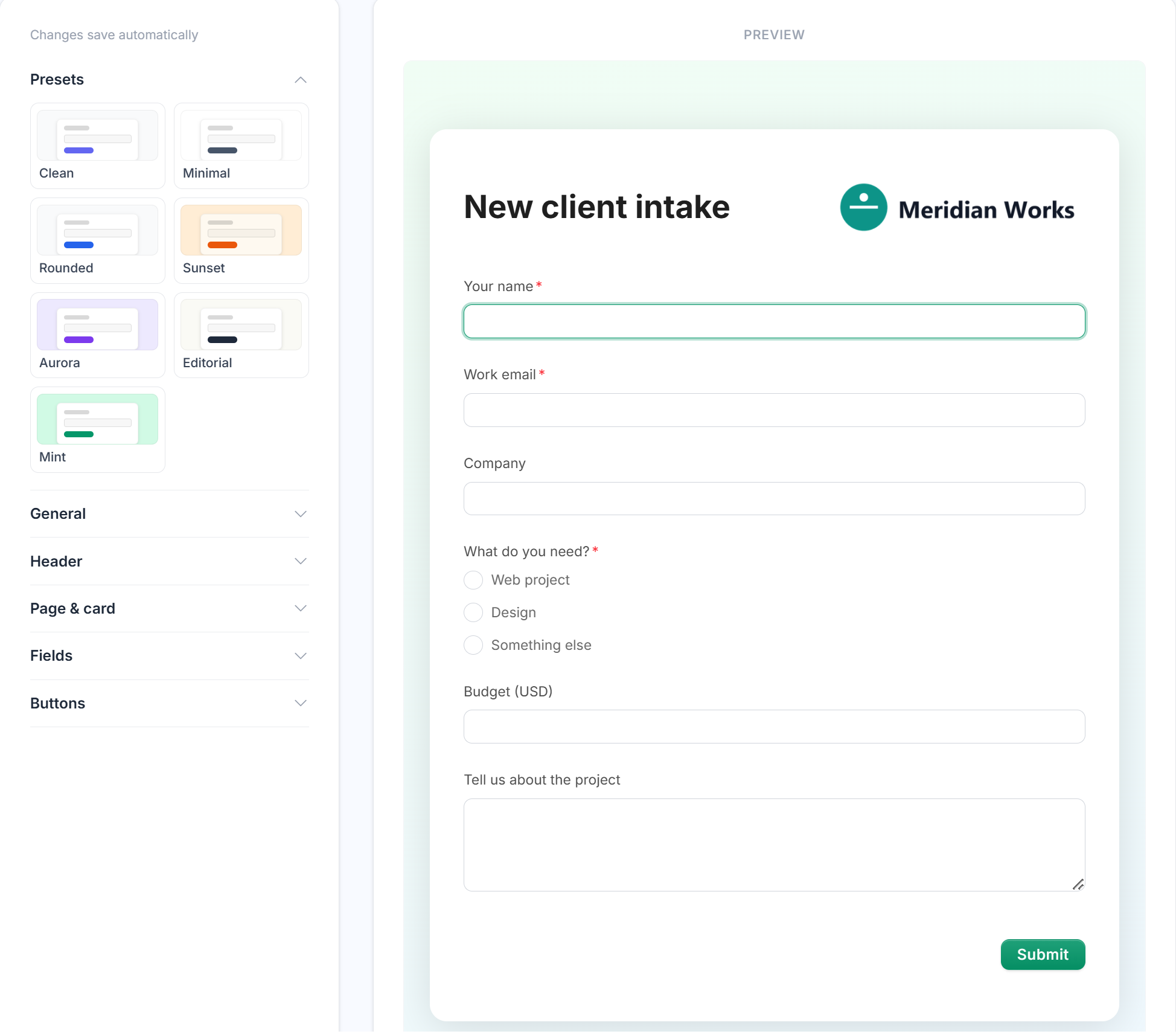
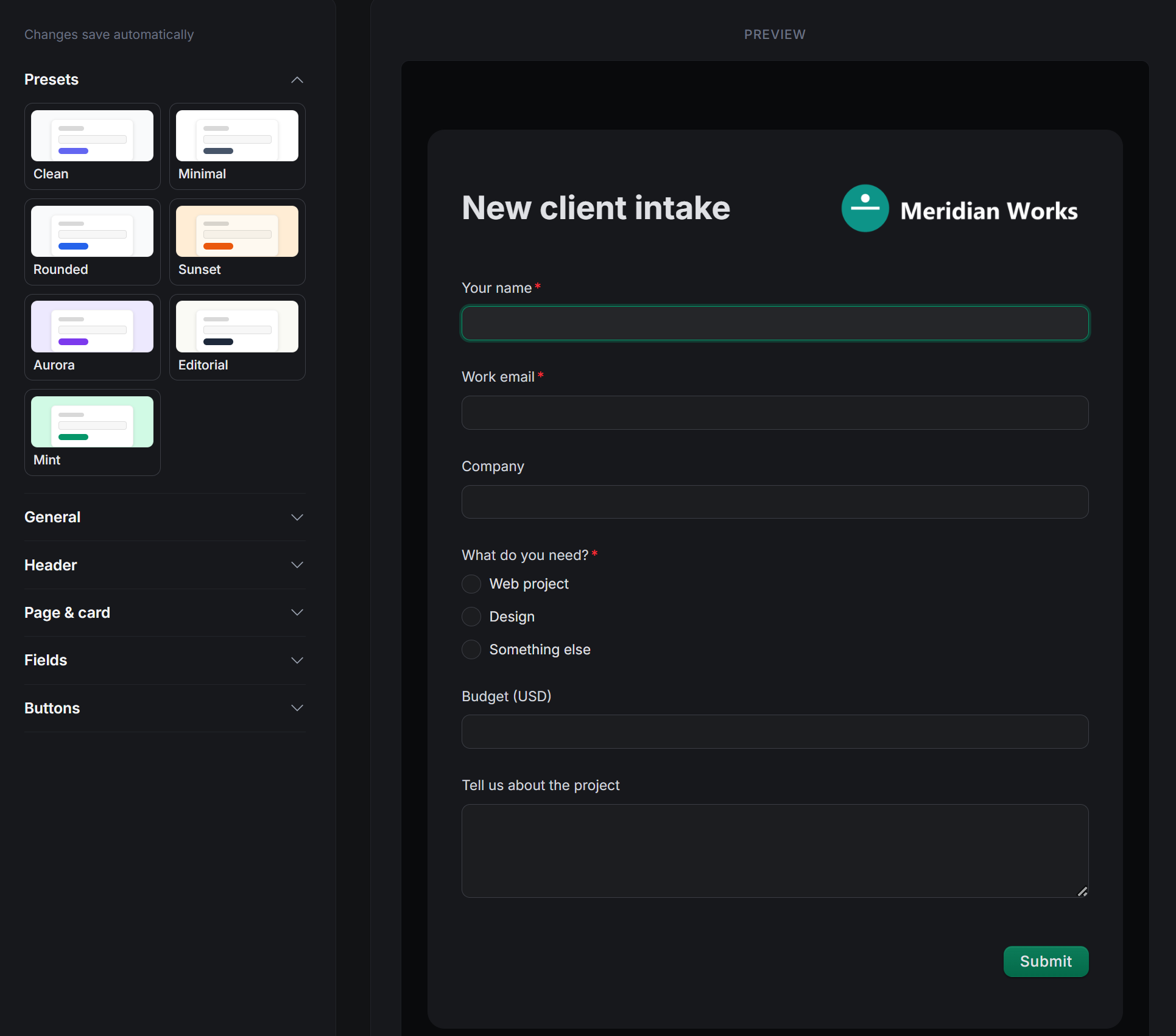
Start from a preset
Seven presets, one click each: Clean, Minimal, Rounded, Sunset, Aurora, Editorial and Mint. Each sets the whole form at once, colours, corners, buttons, spacing, so a preset alone is a finished look. Everything below adjusts from there; you never start from a blank stylesheet.
Make it yours
- General: accent colour, font, overall size, spacing, width, a progress bar or step count, and a custom favicon so the browser tab is yours too.
- Header: your logo, an optional cover image, the title on or off, left or centred, in any colour.
- Page and card: page background, card background, card shadow, an accent bar along the top.
- Fields: label weight and colour, input background, border colour and thickness, corner radius, and how the focus ring looks.
- Buttons: filled, outline or soft; raised or flat; square to pill; text colour; left, centre or right.
Every control is a choice, not a code box. Nothing here needs CSS, and nothing here can break the form on a phone.
Light, dark, or the visitor’s choice
Fix a form to light or dark, or let it follow each visitor’s own device setting. In dark mode the page, card and text switch to dark tones on their own and your accent colour stays, so “system” isn’t a washed-out inversion; it’s the same design in its other mode.
Free, on every plan
Logo, cover, colours, fonts, favicon, dark mode: all of it on the free plan. The one thing that changes with Pro is the small “Made with Nextforms” line at the bottom of the form, which Pro removes.
Want the address to match as well? Pro also puts the form on your own domain, so the link a customer clicks is yours from the first character.
Good for
Any form a customer or applicant sees before they know you: intake and onboarding, quote requests, job applications, event registration, support requests on your help page, and embedded forms that must not look pasted in.